- Preliminary Plots of Charged Particle Events on GPS Satellites from Public Data
- Improved Plots of Charged Particle Events on GPS Satellites, from LANL Public Data
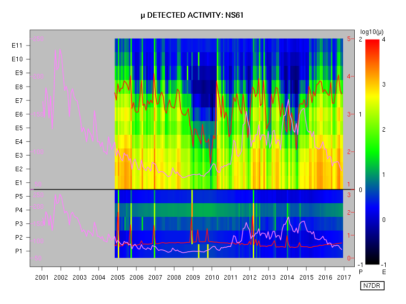
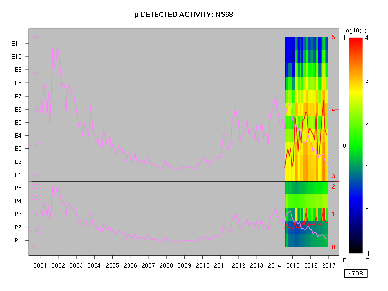
A description of the style of each plot follows the first one.

Several items of interest are plotted in a single figure. Each year is divided into twelve segments of equal duration, and data are averaged and plotted for each such bin, with time increasing in the conventional manner from left to right. The date marked on the x axis corresponds to the start of the given year.
- The upper panel shows data from the eleven electron channels, E1 being the lowest-energy channel and E11 the highest-energy channel. The key to the colours used is at the extreme right hand of the figure, with the logarithmic scale running from 0.1 event per second to 10,000 events per second.
- The lower panel shows data from the five proton channels, P1 being the lowest-energy channel and P5 the highest-energy channel. The key to the colours used is to the left of the rainbow gradient at the right of the figure, with the logarithmic scale running from 0.1 event per second to 1,000 events per second.
- The red wiggly line on the upper panel is the mean total event rate for electrons (i.e., over all electron channels, from E1 to E11). The scale, in events per second, is provided by the red numbers in the upper part of the grey margin that surrounds the main plotting region of the figure. The logarithmic scale runs from 10 events per second (at the black line dividing electrons from protons) to 100,000 events per second (at the top of the plotting region).
- The red wiggly line on the lower panel is the mean total event rate for protons (i.e., over all proton channels, from P1 to P5). The scale, in events per second, is provided by the red numbers in the lower part of the grey margin that surrounds the main plotting region of the figure. The logarithmic scale runs from 1 event per second (at the bottom of the plotting region) to 1,000 events per second (at the black line dividing electrons from protons).
- The purple wiggly lines on the lower and upper panels show the 10.7 cm solar flux as recorded at the Dominion Radio Astrophysical Observatory station at Penticton, British Columbia. The same data are presented in each panel: only the vertical scale differs. For each panel, the scale is given in purple at the left edge of the plotting region, and runs linearly from a flux of 50 units (which is purely notional, as the flux index never reaches such a low value), to a flux of 250 units.


No comments:
Post a Comment
Note: Only a member of this blog may post a comment.