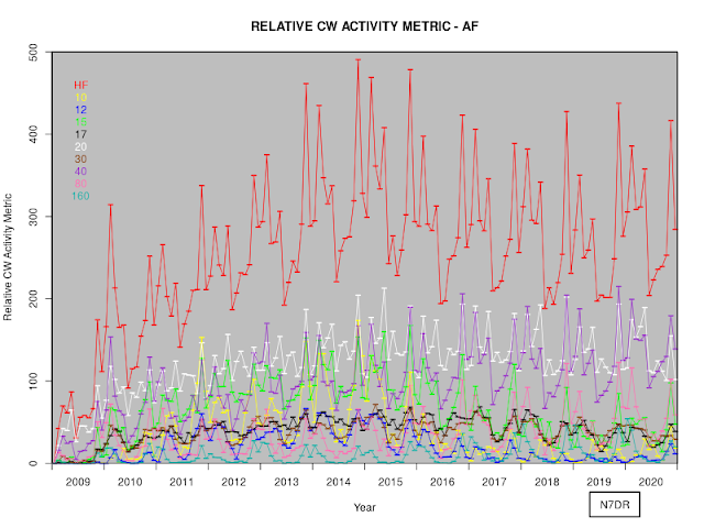
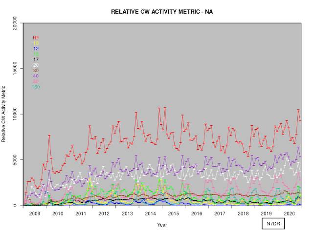
I have generalised the code to plot the CW Activity Metric in the relevant github repository so that it can generate plots of data in bins that are less than a year in duration. For example:
This allows one to see the peaks corresponding to the CQ WW and ARRL DX contests each year, as well as the annual cycles of activity as propagation changes through the year. (And the change in behaviour in 2020, in which the early months of the year saw increased activity, corresponding -- one assumes -- to widespread stay-at-home lockdowns because of the COVID-19 pandemic, followed by a decrease as restrictions were eased over the following months.)
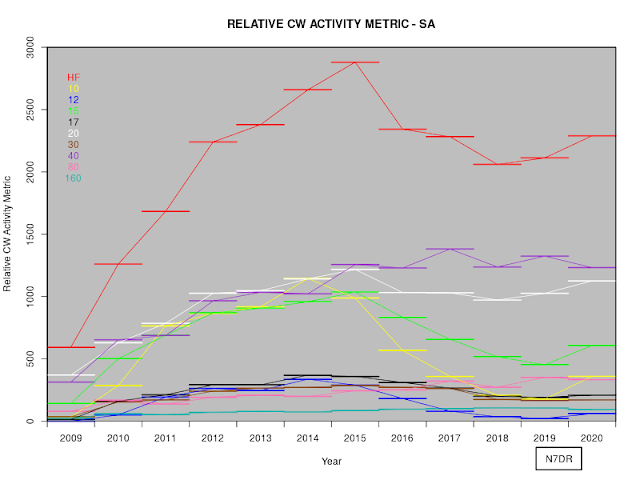
Of course, it's trivial to filter the RBN data before generating the CW metric. So, for example, we can create plots of annual data by continent (ignoring AN, for which there are too few data for meaningful analysis). The graphs are presented without further comment, as I think that they generally speak for themselves:
We can repeat this process, but binning the data into twelve bins of equal duration each year:


