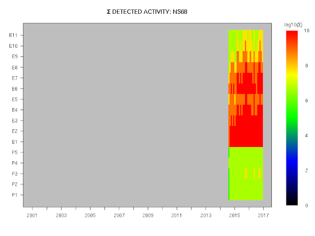
Below are preliminary plots showing the electron and proton detections by the CXD instruments on the GPS satellites.
A series of posts (still unfinished) describing corrections to the originally published data is here.
Although the the corrections and amendments to the data are as yet unfinished, it is now reasonable to provide example plots of the data. The data used for the plot below are the stage 35 data, the file for which has the MD5 checksum b85d41e615126e3912bd50aa55a4af54.
in the plots below, activity has simply been summed on a channel-by-channel basis in bins of roughly one month in duration. That is, each rectangle is coloured in accordance with the total number of recorded events in a channel over a period of roughly one month. No attempt has been made to allow for the positions of the satellites as a function of a time -- but this should be of no consequence when the summation is occurring over a period of weeks.
These plots use the data in the dataset as-is, with no attempt to modify them in any way, and all the plots use a common scale (provided next to each plot) for both electrons (the E channels) and protons (the P channels). These data are from the fields denoted rate_electron_measured and rate_proton_measured, as well as the collection_interval field. Roughly speaking, the representative energy of each channel increases with increasing channel number, although the energy ranges are quite different for the E channels and the P channels, and no attempt has been made in these plots to convert the measured numbers of events to a particle flux spectrum.
Because of the length of the binning interval, we expect the plots for all satellites to be closely similar for the time periods that they have in common.
As expected, the electron data are essentially identical for all the satellites for the periods that they have in common, and the solar cycle of activity can be seen clearly in the plots that extend for a sufficient period.
The proton data seem to show some differences from satellite to satellite, although it is possible that this is an artefact of colour gradient, which clearly is more appropriate for electrons than for protons; the plots should therefore be refined so as to provide more obvious detail in the rendering of the proton data. I leave that task for a later post.


